Key Takeaways
- Reading stock charts is the first skill every trader must master. This beginner's guide explains candlestick charts, support and resistance, trend lines, volume, and key indicators with clear examples.
Why You Need to Read Stock Charts
Stock charts are the language of trading. They show price history, trend direction, volume of trading, and key technical levels — all at a glance. Without reading charts, you're trading blind.
Types of Stock Charts
1. Candlestick Charts (Most Popular)
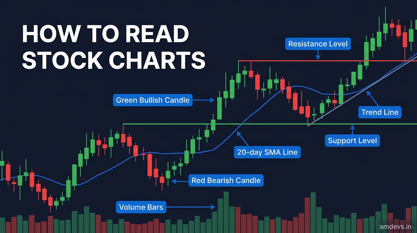
Each "candle" represents one time period (1 minute, 1 day, 1 week). A candle has:
- Body: The range between open and close prices
- Upper wick: Highest price reached
- Lower wick: Lowest price reached
- Green candle: Close > Open (price went up)
- Red candle: Close < Open (price went down)
2. Line Charts
Connects only closing prices. Simple, good for identifying overall trend. Loses intraday price action information.
3. Bar Charts
Shows open, high, low, close (OHLC) as a vertical bar with tick marks. Similar to candlesticks but less visual.
Understanding Support and Resistance
Support Level
A price level where buying interest tends to emerge and prevents the price from falling further. Think of it as a "floor". When price falls to support and bounces, it's a buy signal for many traders.
Resistance Level
A price level where selling pressure tends to emerge and caps further price gains. Think of it as a "ceiling". When price approaches resistance and reverses, it's a sell signal.
Key insight: When price breaks through resistance, that resistance often becomes the new support — this is called "role reversal".
Reading Trend Lines
Trend lines connect a series of price highs or lows to visualise the direction of price movement:
- Uptrend: Connect higher lows — price making higher highs and higher lows
- Downtrend: Connect lower highs — price making lower highs and lower lows
- Sideways: Price ranging between horizontal support and resistance
Reading Volume on Charts
Volume bars appear below the price chart showing how many shares (or contracts) traded in each period:
- High volume on green candles: Strong buying pressure — bullish
- High volume on red candles: Strong selling pressure — bearish
- Low volume breakout: Weak signal, likely to fail
- High volume breakout: Strong signal, more reliable
Key Technical Indicators to Add
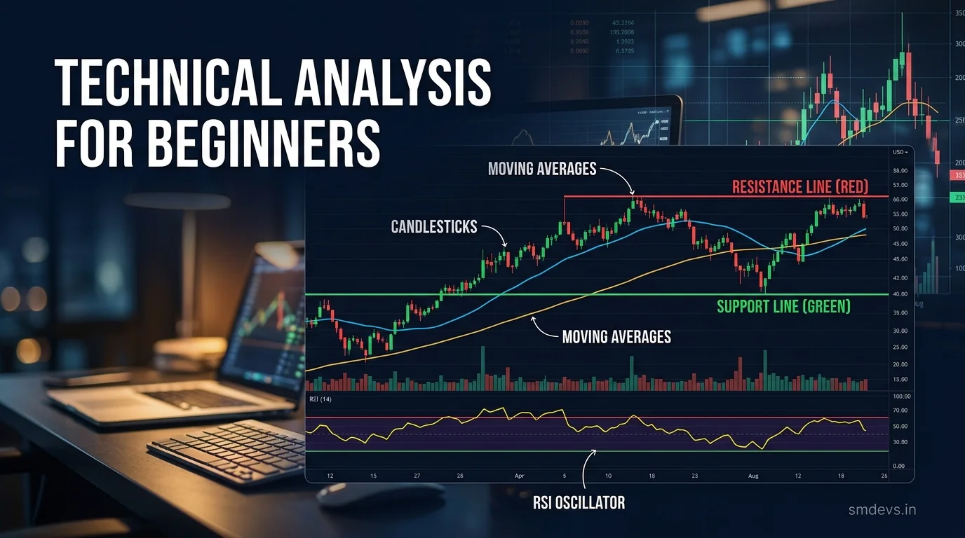
Moving Averages
- 20-day MA: Short-term trend
- 50-day MA: Medium-term trend
- 200-day MA: Long-term trend and health
- Price above 200-day MA = Bullish long-term trend
RSI (Relative Strength Index)
Scale of 0–100. Above 70 = overbought (may correct). Below 30 = oversold (may bounce).
MACD
Shows momentum. When MACD line crosses above signal line → bullish. Below → bearish.
Chart Patterns to Recognise
- Cup and Handle: Bullish continuation pattern
- Head and Shoulders: Bearish reversal pattern
- Double Top: Bearish reversal after two peaks at same level
- Double Bottom: Bullish reversal after two troughs at same level
- Ascending Triangle: Bullish breakout pattern
- Descending Triangle: Bearish breakdown pattern
Practical Chart Reading Checklist
- What is the overall trend? (Uptrend, downtrend, sideways)
- Where are the key support and resistance levels?
- Is price above or below the 200-day MA?
- Is RSI overbought or oversold?
- Is volume confirming the price move?
- Are there any recognisable chart patterns?